Translate

Wednesday, May 31, 2023

Portfolio Optimization Chart for Semiconductor Companies as of 05/31/2023


 The Maximum Sharpe Ratio Portfolio Allocation is a portfolio allocation strategy that aims to maximize the risk-adjusted return of a portfolio. It does so by finding the allocation of assets that provides the highest Sharpe Ratio, which is a measure of the excess return per unit of risk.


In the given information, we have two portfolio allocations: the Maximum Sharpe Ratio Portfolio Allocation and the Minimum Volatility Portfolio Allocation. Let's analyze each of them:


1. Maximum Sharpe Ratio Portfolio Allocation:

   - Annualized Return: 0.45

   - Annualized Volatility: 0.37

   - Allocation:

     - AMD: 0.0%

     - AVGO: 66.56%

     - INTC: 0.0%

     - MU: 0.0%

     - NVDA: 33.44%

     - NXPI: 0.0%

     - QCOM: 0.0%

     - TSM: 0.0%


This allocation provides an annualized return of 0.45 and an annualized volatility of 0.37. It allocates 66.56% of the portfolio to AVGO, 33.44% to NVDA, and leaves the other stocks with a 0% allocation.


2. Minimum Volatility Portfolio Allocation:

   - Annualized Return: 0.16

   - Annualized Volatility: 0.29

   - Allocation:

     - AMD: 0.0%

     - AVGO: 42.88%

     - INTC: 33.34%

     - MU: 0.0%

     - NVDA: 0.0%

     - NXPI: 0.0%

     - QCOM: 0.0%

     - TSM: 23.78%


This allocation provides a lower annualized return of 0.16 but also lower annualized volatility of 0.29. It allocates 42.88% of the portfolio to AVGO, 33.34% to INTC, and 23.78% to TSM, with the remaining stocks having a 0% allocation.


To further understand these allocations, let's also consider the individual stock returns and volatilities:


- AMD: Annualized Return: 0.28, Annualized Volatility: 0.51

- AVGO: Annualized Return: 0.37, Annualized Volatility: 0.32

- INTC: Annualized Return: -0.11, Annualized Volatility: 0.35

- MU: Annualized Return: 0.25, Annualized Volatility: 0.43

- NVDA: Annualized Return: 0.6, Annualized Volatility: 0.55

- NXPI: Annualized Return: 0.22, Annualized Volatility: 0.4

- QCOM: Annualized Return: 0.09, Annualized Volatility: 0.4

- TSM: Annualized Return: 0.16, Annualized Volatility: 0.3


These values represent the annualized returns and volatilities for each individual stock. 


In summary, the Maximum Sharpe Ratio Portfolio Allocation aims to maximize the risk-adjusted return by allocating a majority of the portfolio to AVGO and NVDA, while minimizing exposure to other stocks. The Minimum Volatility Portfolio Allocation, on the other hand, prioritizes reducing volatility by allocating a significant portion to AVGO, INTC, and TSM, while minimizing exposure to other stocks. The final choice between these two allocations depends on the investor's risk appetite and investment objectives.

Tuesday, May 30, 2023

XLK ETF as of 05/30/2023

 The XLK ETF (Exchange-Traded Fund) is an investment fund that tracks the performance of the technology sector in the United States. XLK stands for "Technology Select Sector SPDR Fund." It is one of the many sector-specific ETFs offered by State Street Global Advisors.


The XLK ETF aims to provide investors with exposure to a diversified portfolio of technology companies. It seeks to replicate the performance of the Technology Select Sector Index, which includes companies primarily involved in various technology-related industries such as software, hardware, semiconductors, internet services, and more.


Investing in the XLK ETF allows individuals to gain exposure to a broad range of leading technology companies in a single investment. By doing so, investors can benefit from the growth potential and innovations within the technology sector.

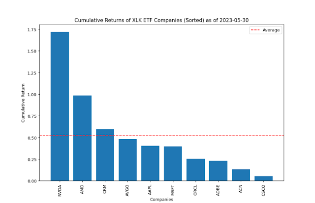
The following information presents the cumulative returns for XLK ETF companies in the order of the sorted returns:

The technology sector has been experiencing a significant surge in recent days, with tech stocks performing exceptionally well. The chart below highlights the top 10 holdings in XLK ETFs, showcasing the notable impact of the AI industry on these holdings. Notably, NVDA and AMD have emerged as leaders, contributing significantly to the increased presence within the top 10 holdings in XLK ETFs.


The provided chart presents a comprehensive technical analysis of the XLK ETF, focusing on its performance and trends since 2023.


The impact of imports from China on US manufacturing jobs

 The impact of U.S.-China trade relations has been significant over the years. In the 1970s, diplomatic relations were reestablished, but it was not until the 1990s that trade between the two countries started to expand. The growth in U.S.-China trade has been substantial, with imports from China accounting for a significant portion of all U.S. imports and exports. The U.S. government's policies favoring international trade and the granting of normal trade relations to China played a role in this increase.

The composition of imports and exports between the U.S. and China reveals clear patterns. China has a comparative advantage in industries such as furniture, textiles, apparel, and electronics, accounting for a significant share of U.S. imports in these categories. U.S. exports to China, on the other hand, are more concentrated in agriculture and forestry products.

The rise in trade with China has raised concerns about its impact on U.S. employment, particularly in the manufacturing sector. Studies suggest that the increase in imports of Chinese goods has contributed to significant declines in U.S. manufacturing jobs. Industries facing stronger competition from Chinese goods have experienced contractions in employment relative to others.

The U.S.-China trade war, which began in 2018, disrupted the growth in trade between the two countries. The U.S. imposed tariffs on Chinese imports, leading to a decline in imports from and exports to China. However, trade has partially recovered in recent years, driven by increased U.S. consumption during the pandemic and imports from China that were not subject to tariffs.

The provided chart depicts the areas in manufacturing employment that have been affected by imports from China. It is evident that the sectors most significantly impacted are apparel and accessories, as well as computer and electronic products. These sectors are characterized by labor-intensive processes, which makes them more vulnerable to competition from Chinese imports. On the other hand, capital-intensive sectors show relatively less impact. It is worth noting that the Food and Kindred products sector actually experienced a positive effect on employment, suggesting a favorable outcome in that particular area.


Source: https://www.stlouisfed.org/annual-report/2022/shifting-tides-global-trade

Food and health care hold the most predictive value relative to noise

 The St. Louis Federal Reserve's article, "What Do Components of Key Inflation Measures Say about Future Inflation?" delves into the significance of various elements within the Consumer Price Index (CPI) and Personal Consumption Expenditures (PCE) as indicators of future inflation.


The piece distinguishes between "headline" and "core" inflation. The former is a comprehensive measure that includes a weighted assortment of goods and services from all household spending categories. The latter, on the other hand, omits food and energy, primarily due to their price volatility.


The article refers back to a 2011 study by Michael McCracken that scrutinized the signal-to-noise ratio (SNR) of select CPI inflation components. The SNR gauges the predictive value of a component in relation to its variance, with a lower SNR indicating less predictive utility for future inflation, and vice versa.


The updated analysis reveals an uptick in the SNR of food prices, implying that food expenditures could serve as a valuable indicator of future headline inflation. In fact, food now boasts the highest SNR among all CPI components, closely followed by health care. This indicates that food and health care hold the most predictive value relative to noise.


When it comes to PCE inflation components, the SNR of food services is approximately triple that of food purchases, suggesting that food services, in particular, play a crucial role in forecasting future headline inflation. The SNR of health care outstrips all other PCE components, reinforcing its escalating predictive importance as observed with CPI.


In conclusion, the article posits that despite the excessive volatility of energy prices rendering them unsuitable as predictors, food prices—especially food services—and health care have proven to be effective in forecasting future inflation.


Source:https://www.stlouisfed.org/on-the-economy/2023/may/components-key-inflation-measures-say-future-inflation


Monday, May 29, 2023

The US dollar vs China yuan as world's reserve currency

The US dollar is the world's reserve currency, meaning that it is the most widely used currency in international trade and finance. There are a number of reasons why the dollar is the world's reserve currency, including:

  • Stability: The US dollar is seen as a stable currency, which is important for international trade and finance.
  • Liquidity: There is a large supply of US dollars available in the global market, which makes it easy to buy and sell.
  • Transparency: The US government publishes regular reports on the US economy, which helps to make the dollar more transparent.

China has been trying to promote the use of the yuan as a reserve currency, but there are a number of reasons why even China doesn't want the yuan to replace the dollar as the world's reserve currency. These reasons include:

  • Capital controls: China has strict capital controls, which make it difficult for foreign investors to buy and sell yuan.
  • Financial system: China's financial system is not as developed as the US financial system, which makes it less attractive for foreign investors.
  • Transparency: China's government is not as transparent as the US government, which makes it more difficult for foreign investors to assess the risks of investing in China.

In conclusion, there are a number of reasons why even China doesn't want the yuan to replace the dollar as the world's reserve currency. The dollar is seen as a stable, liquid, and transparent currency, while the yuan is not. China is still working to make the yuan more attractive to foreign investors, but it is likely to be a long process.

Here are some additional details from the article:

  • The US dollar is the most widely used currency in international trade and finance. In 2021, the dollar accounted for 63% of global foreign exchange reserves.
  • The US dollar is seen as a stable currency. This is because the US government has a strong track record of managing its economy and its debt.
  • The US dollar is liquid. This means that there is a large supply of dollars available in the global market, which makes it easy to buy and sell.
  • The US dollar is transparent. The US government publishes regular reports on the US economy, which helps to make the dollar more transparent.
  • China has strict capital controls. This means that it is difficult for foreign investors to buy and sell yuan.
  • China's financial system is not as developed as the US financial system. This makes it less attractive for foreign investors to invest in China.
  • China's government is not as transparent as the US government. This makes it more difficult for foreign investors to assess the risks of investing in China.

The Return on investing in a College Education

The article titled "The Return on Investing in a College Education" from the St. Louis Federal Reserve discusses the economic value of higher education by comparing its costs and benefits. The author, Guillaume Vandenbroucke, an economist and assistant vice president at the Federal Reserve Bank of St. Louis, focuses on the economic aspect, ignoring other reasons for pursuing or avoiding college education.

Key points from the article include:

1. **Costs of Higher Education**: The cost of higher education has risen sharply over the last few decades. For each dollar of tuition paid in 1980, one had to pay $3.70 in 2000 and $8.30 in 2020. This indicates that the cost of tuition grew more quickly than inflation.

2. **Benefits of Higher Education**: The pecuniary benefit of higher education is the sequence of earnings one receives throughout a lifetime of work above the earnings that one would have received without higher education. In 1980, college-educated workers earned more than high school-educated workers, but the difference never exceeded $10,000. In 2000 and 2020, however, the earnings difference was noticeably higher than it was in 1980, even after adjusting for inflation.

3. **Return on Investing in a College Education**: The rate of return on a college education can be computed in the same way as the rate of return on an asset. On average, college-educated workers paid $13,996 (4 x $3,499) in 1980 to receive the extra income represented by the blue line in the figure above throughout the rest of their lives. If one sums up the extra income these workers received and adjusts for the time it took to get this income, the rate of return on the college tuition they paid is very large at 20.5%.

4. **Rates of Return across Time, Gender, and Race**: The rates of return on a college education for six demographic groups in 1980, 2000, and 2020 were calculated. Although the rates of return vary greatly across time, gender, and race, they are high relative to the returns one finds in financial markets. In all three years, the highest rates of return are for Asian men and Asian women. Black men and Black women have the lowest rates of return in two of the three years.

5. **Considerations Affecting the Estimated Rates of Return**: The calculation described above abstracts considerations that may affect the estimated rates of return on a college education. These considerations include a selection issue, an employment issue, a mortality issue, and a nonpecuniary benefits issue.

The author concludes that education has a return in essentially the same way any asset does: There is an initial investment entitling the investor to a subsequent stream of income. Comparing higher education’s cost (in this case tuition, which is the initial investment) and its benefit (the higher incomes that college-educated workers earn) as if they were the price and payoff of a financial asset yields estimates of a return that appears to be quite high. Despite rising tuition over the years, college enrollment rates are still high because students and their families recognize that the payoff can be greater.

S&P 500 Earnings Yield by Month and Price to Book Value by Quarter as of 05/28/2023


The provided chart illustrates the monthly S&P 500 Earnings Yield. The historical average stands at 7.22%, while the latest yield is 4.11%, indicating a lower value compared to the historical average. This suggests that S&P 500 stocks have become relatively more expensive than the historical average. 

In addition, the second chart displays the S&P Price to Book Value on a quarterly basis. The historical average for the S&P 500 price to book value is 2.99, whereas the latest value is 4.1. This implies that S&P 500 stocks have become even more expensive.

In summary, both charts indicate a trend of increased expense in S&P 500 stocks, with the earnings yield and price to book value surpassing historical averages.


Sunday, May 28, 2023

Pandemic labor force participation and net worth fluctuations from Federal Reserve Bank of ST.LOUIS

 This passage is a summary of the research paper's findings. The researchers argue that the increase in net worth due to booming asset returns in 2020-21 significantly contributed to the drop in labor force participation rates during the same period, especially among older workers nearing retirement.


Key points include:


1. The labor force participation rate (LFPR) for prime-age workers has mostly recovered to pre-pandemic levels, but the LFPR for workers older than 55 seems to have declined permanently.


2. Using a statistical model, the researchers found that the percentage of Americans who have retired is significantly higher than the predicted trend, leading to 3.3 million "excess retirees" as of December 2022.


3. The researchers used a model of wealth effects on labor supply and estimated changes in net worth to explain a significant share of these "missing workers" and "excess retirees". They imputed realized returns on major asset classes to micro data on individual balance sheets and portfolio composition as of 2019 from the Survey of Consumer Finances (SCF). They then applied a model that relates changes in net worth to labor force participation decisions.


4. Depending on whether they considered the population aged 55-70 or everyone aged 55 and older, this exercise helped explain between 28.7% and 51.1% of the drop in LFPR in the 2020-21 period and between 46% and 82% of all "excess retirements".


5. The researchers acknowledge that there are many other reasons, besides wealth effects, why individuals may have chosen to retire during this period. However, they argue that these changes in net worth may have enabled retirements, even if primarily driven by these other reasons.


6. The researchers also note that recent developments in financial markets during 2022 have undone some of these abnormally high returns, especially in the stock market. However, long-run demographic trends related to decreased fertility and population aging create downward pressure on the LFPR, preventing it from returning to its pre-pandemic levels.


Source: https://research.stlouisfed.org/wp/more/2023-010


S&P/ Case-Shiller U.S. Home Price Index as of 02/2023


The chart displays the S&P/Case-Shiller U.S. Home Price index for major cities as of February 2023. The first chart illustrates the latest percent changes for these cities. Among the cities on the West Coast, San Francisco, Seattle, San Diego, Denver, Las Vegas, and Los Angeles experienced a decline in home prices. In contrast, cities in the South such as Dallas and Atlanta saw the highest increase in home prices. Other cities that experienced an increase in home prices include Atlanta, New York, Boston, Chicago, Washington DC, and Miami.
The following charts depict the percentage changes from the previous year in major cities across the United States. While some cities have experienced a decline in home prices, others continue to show positive growth. However, it is noteworthy that all cities have been experiencing an overall downward trend in home prices.

Among the major cities in the United States, Seattle and San Francisco have witnessed the most significant declines in home prices. These cities have experienced substantial decreases in housing prices compared to other cities.

Despite the overall downward trend in home prices, Dallas and Atlanta have managed to maintain positive growth rates in their housing markets. These cities continue to experience increases in home prices, albeit at a slower pace compared to previous periods.


Saturday, May 27, 2023

The Rise and Fall of M2 from St. Louis Fed

 During the pandemic, M2, a broad measure of money supply, experienced an unusual surge, increasing by more than 25%. This was a significant leap compared to the 5-6% increase observed in the aftermath of the financial crisis. Intriguingly, even during the financial crisis, when the monetary base expanded by more than 25%, M2 did not exhibit a corresponding increase. However, in an unprecedented development, M2 began to decline at a negative rate following the pandemic.

Inflation rates, as indicated by Personal Consumption Expenditures (PCE), appeared to mirror the trajectory of M2. The PCE began to rise approximately a year after the M2 surge. Given that M2 started to decline negatively in December 2022, it is projected that PCE will follow a similar path and potentially decrease by the end of 2023.


The article from the Federal Reserve Bank of St. Louis discusses the rise and fall of M2, a broad measure of the money supply that includes currency and various types of bank and money market mutual fund deposits that are relatively liquid.

Key points from the article include:

1. The year-over-year growth rate of M2 has behaved unusually since February 2020. M2 grew at record rates during the COVID-19 pandemic from February 2020 through 2022 but has declined at record rates since late 2022. The 26.9% rate of year-over-year growth in February 2021 exceeds the rates of growth during either the quantitative easing programs of 2008-15 or the inflations of the 1970s and 1980s. At the same time, the current negative rates of growth are also unprecedented.

2. The Monetarist School of Economics, associated with Milton Friedman and the University of Chicago, argued for the importance of monetary aggregates in economic activity. However, Monetarism fell out of favor because it was nearly impossible to find strong and consistent relations between monetary aggregates and variables of interest, such as prices and output.

3. The article suggests that recent inflation behavior has been consistent with a lagged effect of M2 on personal consumption expenditures (PCE) inflation. PCE inflation began to rise in February 2021, at the peak of M2 growth rates and a year after M2 growth began soaring in February 2020.

4. Monetary policy decisions taken to curtail inflation helped reduce M2 growth to negative levels. In November 2021, the FOMC announced that it would begin to "taper" its asset purchases, which finally ended in March 2022, the same month in which the FOMC began raising the federal funds target.

5. The article notes that huge growth in the monetary base in 2008-15 did not spark unusual growth in M2 or inflation during that period. This occurred because banks essentially swapped bonds for reserves held at the Federal Reserve.

6. The article concludes by stating that macroeconomic theories are approximations, at best, because complex relationships between unpredictable people make the global economy a constantly evolving place. However, advocates of links between monetary aggregates and prices will surely study this episode closely in years to come.

Source: https://research.stlouisfed.org/publications/economic-synopses/2023/05/25/the-rise-and-fall-of-m2


The International Monetary Fund (IMF) expects a slowdown in the U.S. economy in 2024

Despite significant tightening of fiscal and monetary policy in 2022, the U.S. economy has demonstrated remarkable resilience. However, the International Monetary Fund (IMF) anticipates a slowdown in the U.S. economy in the coming years. Specifically, it projects a growth rate of just 1% for the U.S. economy in 2024. 


In terms of monetary policy, the Federal Reserve is expected to implement a 50 basis point cut next year. This adjustment is in response to the persistent inflation that the U.S. has been experiencing. The Core Personal Consumption Expenditures (PCE) inflation rate, which excludes volatile items like food and energy, is forecasted to decrease to 2.8%. 


Despite this decrease, inflation remains a significant concern. To combat this persistent issue, the Federal Reserve may need to maintain a high federal funds rate. This strategy aims to curb inflation and stabilize the economy.


The International Monetary Fund (IMF) summarizing the findings of their 2023 Article IV Mission to the United States. Here are the key points:


1. **Resilient Demand and a Robust Labor Market**: The U.S. economy has shown resilience despite significant tightening of fiscal and monetary policy in 2022. Consumer demand has been strong, supported by a drawdown of pent-up savings and solid growth in real disposable incomes. The labor force participation of prime-age workers has risen above its pre-pandemic peak, and the unemployment rate for women and African Americans has fallen to historical lows. Real wages have been rising faster than inflation since mid-2022. 


2. **Persistent Inflation Problem**: The strength in demand and labor market outcomes has contributed to more persistent inflation. Goods inflation has leveled out and shelter price growth is expected to start moderating in the coming months. However, past nominal wage increases are now feeding into non-shelter services. Core and headline PCE inflation are expected to remain materially above the Fed’s 2 percent target throughout 2023 and 2024.


3. **Important Near-Term Risks**: The large and rapid increase in interest rates may not be sufficient to bring inflation back to target. There is a risk that the Federal Reserve will have to raise the policy rate by significantly more than is currently expected to return inflation to 2 percent.


4. **Fiscal Imbalances**: On a general government basis, fiscal policy is expected to be procyclical in 2023. With the economy operating well above potential and inflation a persistent problem, there is a strong case for greater fiscal restraint in 2023-24.


5. **Trade Policy**: Over the last few years, global concerns have been raised over the resilience of supply chains, including as relates to national security. The U.S. would be better served by maintaining the open trade policies that have been vital to boosting growth.


6. **Financial Stability Risks**: Recent bank failures highlight the potential systemic risks posed by even relatively small financial intermediaries. High leverage, liquidity and duration mismatches, as well as interconnectedness between banks and non-bank financial institutions pose additional risks.


7. **Supply Side Reforms**: A range of policies were proposed in the President’s budget that would help address supply side constraints to growth. These include tackling poverty, incentivizing greater labor force participation, expanding healthcare coverage, increasing access to education, improving progressivity, and revising the global minimum.


Source: United States of America: Staff Concluding Statement of the 2023 Article IV Mission (imf.org)

Economic Letter from the Federal Reserve Bank of San Francisco titled "The Rise and Fall of Pandemic Excess Savings"

Economic Letter from the Federal Reserve Bank of San Francisco titled "The Rise and Fall of Pandemic Excess Savings". Here is a summary of the key points:


1. **Excess Savings During Pandemic**: U.S. households accumulated savings at unprecedented rates during the pandemic due to the strong fiscal response and lower consumer spending. Despite recent rapid drawdowns of these funds, a substantial amount of excess savings still remains in the aggregate economy.


2. **Savings Across All Income Levels**: Since 2020, households across all income levels have held a historically large share of savings in cash or other easily accessible forms. These funds could potentially support personal spending at least into the fourth quarter of 2023.


3. **Fiscal Support and Savings**: Pandemic-related fiscal support led to a significant increase in disposable income in the U.S. economy at a time when health-related economic closures and social distancing led to a significant drop in household spending. As a result, aggregate personal savings rose rapidly, far beyond its pre-pandemic trend and much higher than in previous recessions.


4. **Excess Savings Post-Pandemic**: Despite a rapid drawdown of savings in recent months, there is still a large stock of aggregate excess savings in the economy—some $500 billion. These excess savings could continue to support consumer spending at least into the fourth quarter of 2023.


5. **Fiscal Spending and Excess Savings**: The fiscal response to the onset of the pandemic was swift and significant. Between 2020 and 2021, the federal government launched several stimulus packages that injected about $5 trillion into the U.S. economy.


6. **Household Savings Across Income Distribution**: Estimates suggest that households in the two lowest groups in the income distribution hold between 4% and 29% of the total stock of excess savings, while the highest income group holds between 32% and 67%.


7. **Conclusion**: The aggregate stock of excess savings is expected to continue to support consumer spending at least into the fourth quarter of 2023. However, this outlook is uncertain and depends on factors such as whether households have developed a preference for higher savings, significantly shifted their spending patterns, or substituted other sources of income for the expired pandemic-era cash inflows.


Source: The Rise and Fall of Pandemic Excess Savings | San Francisco Fed (frbsf.org)