Translate

Sunday, October 20, 2024

U.S. Housing Market Trends: Cooling Down or Stabilizing?

The U.S. housing market is undergoing significant changes, reflecting a shift from the hyper-competitive landscape of recent years toward a more balanced environment. Recent data on homeownership, vacancy rates, and housing inventory show a complex picture of both growth and cooling dynamics. Let’s dive into the latest numbers and what they mean for buyers, renters, and investors.


A Gradual Rise in Homeownership and Occupancy

The homeownership rate in the U.S. has seen a minimal monthly increase of 0.15% and a slight annual growth of 0.31%. This stability reflects a consistent demand for homeownership, though it’s not surging as it did during the pandemic-driven housing boom. Similarly, the owner-occupied housing units grew by 0.32% month-over-month and an impressive 4.45% year-over-year. This signals that more households are settling into homeownership, albeit at a modest pace.

Meanwhile, the renter-occupied housing units saw a small monthly rise of 0.34% and a 3.33% annual increase. This steady growth in both owner- and renter-occupied units suggests that while homeownership remains desirable, renting is still a vital part of the housing landscape, particularly as affordability issues persist for many potential homebuyers.

Rising Vacancies: A Sign of Shifting Market Dynamics

Perhaps the most telling indicator of market cooling is the sharp rise in vacant housing units for sale, which jumped 14.03% over the past month and 14.82% over the past year. This could be a sign that higher mortgage rates and elevated home prices are slowing down buyer demand, leading to more homes sitting on the market.

Similarly, the vacant housing units for rent rose by 1.79% in the past month and 11.06% over the past year. The increase in rental vacancies might suggest that rental supply is beginning to catch up with demand, potentially leading to more options and possibly stabilizing rental prices in the future. The rental vacancy rate remained unchanged over the last month but grew by 6.45% year-over-year, further reinforcing this trend.

On the homeowner side, the homeowner vacancy rate saw a significant monthly spike of 12.5%, though it has remained stable year-over-year. This could indicate that certain areas are experiencing short-term fluctuations in home sales, where sellers are finding it harder to close deals quickly.

A Moderating Supply of Housing Units

The overall housing inventory continues to expand at a moderate pace. The total number of housing units in the U.S. increased by 0.27% over the past month and 3.31% over the past year. This steady growth in inventory is a healthy sign that the market is balancing itself out after years of undersupply.

The household estimates also grew slightly, with a 0.05% monthly increase and a 1.04% annual rise, reflecting slow but consistent household formation across the country.

What Does This Mean for the Housing Market?

The U.S. housing market is clearly in a transition phase. The sharp increases in vacant units for sale and rent suggest a cooling off from the high-demand environment seen during the pandemic. However, the steady rise in both owner-occupied and renter-occupied units indicates that demand, while easing, is not collapsing.

For buyers, this may signal an opportunity to find more options in the market as inventories rise and competition decreases. However, affordability remains a key challenge, with high mortgage rates continuing to deter many potential homeowners.

For renters, the increase in rental vacancies could offer some relief in the form of more available units and potentially stabilizing rent prices. But the rise in rental vacancy rates is not yet significant enough to signal a major drop in rental costs.

For investors, the growing number of vacant properties and rising inventories suggest that the housing market is gradually moving towards equilibrium. While it’s no longer the hot seller’s market it once was, those who are patient and strategic may find opportunities, particularly if interest rates stabilize or decrease in the near future.

Conclusion: A Cooling Market with Opportunities

The current housing data reveals a market that is cooling but not collapsing. Rising vacancies and increased inventory suggest a shift from a seller’s market to a more balanced environment. This presents both challenges and opportunities depending on one’s perspective—whether you're a buyer, renter, or investor. As we move forward, interest rate trends, demographic changes, and housing policies will play crucial roles in shaping the housing market’s future direction.

In summary, the U.S. housing market is stabilizing, offering hope for buyers and renters while giving investors a chance to strategize in a more balanced market. It’s a time for cautious optimism and careful planning, as the market evolves in response to economic conditions.

Friday, October 18, 2024

Exploring the Trends in New Privately-Owned Housing Units


The housing market is a key economic indicator, often reflecting broader economic trends. The latest data on new privately-owned housing units shows some interesting shifts across different categories of housing. Let's dive into the highlights from the recent numbers.

1. Single-Family Homes: Resilience Amidst Decline

The market for single-family units shows signs of resilience. Housing starts for single-family units have grown both month-over-month (+2.7%) and year-over-year (+5.55%). Similarly, single-family units authorized for construction saw a small monthly increase (+0.31%), although the annual change is down (-1.22%).

This trend reflects sustained demand for single-family homes, even as other sectors of the housing market struggle. Despite challenges like high mortgage rates, the single-family housing segment remains relatively robust, potentially buoyed by the desire for personal housing space.

2. Multi-Family Units: Steep Declines

In contrast to the single-family sector, the multi-family housing market (5+ units) is experiencing significant declines. Both housing starts and units under construction in this category have seen substantial decreases, with annual declines of -15.69% and -16.75%, respectively. This suggests a slowdown in larger, multi-unit projects, which could be due to increasing construction costs or higher interest rates impacting developers.

One notable exception is the completion of multi-family units, which saw a remarkable annual increase of 41.86%. This suggests that projects started earlier have now finished, but new projects are not being initiated at the same rate.

3. New Housing Starts: Overall Decline

Overall, new housing starts have declined slightly month-over-month (-0.51%) and annually (-0.66%), reflecting broader concerns about the housing market. Authorized permits, a leading indicator of future construction activity, show similar declines (-2.86% monthly and -5.74% annually), suggesting that fewer housing projects are entering the pipeline.

4. Market Segmentation and Future Outlook

The market for units in buildings with 2-4 units is particularly weak, with a dramatic 65.52% monthly drop in starts. This may point to a shrinking interest in smaller multi-family projects, which could reflect economic uncertainty or shifts in developer preferences.

Overall, the data presents a mixed picture: while single-family homes remain relatively strong, the broader housing market—especially in multi-family construction—is cooling down. The slowdown in housing starts, alongside declining authorized permits, points to potential challenges ahead for the housing industry. However, the market for completed homes, particularly multi-family units, continues to show strength, indicating that some projects are still moving to fruition despite broader market pressures.

As we move forward, interest rates, construction costs, and broader economic conditions will play pivotal roles in shaping the trajectory of the housing market.

Thursday, October 17, 2024

Title: U.S. Economy Signals Slowdown: Analyzing Industrial Production and Capacity Utilization Trends

As we assess the current state of the U.S. economy, two key metrics provide valuable insights into industrial activity: industrial production and capacity utilization. These indicators reflect how well industries are performing and whether they are operating at full potential. In this post, we’ll dive into the latest monthly and annual changes in these metrics and discuss what they mean for the broader U.S. economic landscape.


Current Data Overview:

Below are the most recent changes in industrial production and capacity utilization:

MetricLatest Monthly Change (%)Latest Annual Change (%)
Industrial Production: Total Index-0.28%-0.64%
Capacity Utilization: Manufacturing (NAICS)-0.51%-1.80%
Industrial Production: Manufacturing (SIC)-0.38%-0.52%
Capacity Utilization: Total Index-0.39%-1.82%
Industrial Production: Manufacturing (NAICS)-0.39%-0.41%

These declines suggest that the U.S. industrial sector, particularly manufacturing, is experiencing contraction. But how does this compare to historical data, and what can we learn from it?

A Historical Perspective:

Historically, industrial production and capacity utilization are key indicators of economic health. During periods of growth and expansion, these figures tend to rise modestly, signaling strong demand and efficient use of production capabilities. Conversely, significant drops in these metrics often precede or coincide with economic slowdowns or recessions.

Recessionary Patterns:

Looking back at past recessions—such as the 2008 financial crisis and the 2020 COVID-19 downturn—industrial production saw sharp declines, and capacity utilization dropped significantly below optimal levels. During those periods, these metrics fell by much larger margins than what we see today. While the current data is concerning, it has not yet reached the levels typically seen in severe recessions.

The current monthly declines of around 0.28% to 0.51% and annual declines of up to 1.82% suggest a softening industrial environment. However, this isn’t on the same scale as the rapid contractions of past economic crises, which sometimes saw monthly drops of 1-2% and annual declines exceeding 5%.

Business Cycle Position:

Based on this data, the U.S. economy may be transitioning from a late expansion phase to a slowdown or contraction. The manufacturing sector, in particular, is showing signs of strain, with facilities operating below their full capacity. Historically, when capacity utilization drops, it indicates that businesses are producing less due to reduced demand, lower consumer spending, or supply chain disruptions.

What This Means for the U.S. Economy:

The recent declines in industrial production and capacity utilization point to a cooling economy, especially in manufacturing. Here's what it could mean for the broader U.S. economy:

  1. Cooling Industrial Activity:

    • Both the industrial production and manufacturing indexes have declined, suggesting a reduced output from U.S. factories. This contraction could be a result of weakening consumer demand, tighter financial conditions, or broader global economic challenges.
  2. Underutilized Capacity:

    • Capacity utilization rates in manufacturing are decreasing. When businesses are operating below their full capacity, it typically reflects declining demand for goods or inefficiencies in production processes. Historically, this is a warning sign of weaker economic growth.
  3. Possible Recessionary Signal:

    • While the current declines are moderate compared to previous recessions, if this trend persists or deepens, it could lead to further economic contraction. The combination of declining production and lower capacity utilization is often seen during the early stages of a downturn.
  4. Impact on Employment and Investment:

    • A slowdown in manufacturing and industrial production often results in reduced hiring and lower capital investments by companies. This can have ripple effects across the economy, impacting consumer confidence, wages, and spending.

The Path Ahead:

Given the current state of industrial production and capacity utilization, the U.S. economy is clearly showing signs of slowing down. However, it’s important to note that this data does not yet suggest a severe recession, but rather a period of reduced growth or a “soft landing.” Several factors, including future monetary policy decisions, inflation trends, and global supply chain dynamics, will play a critical role in determining whether the U.S. economy stabilizes or continues to decline.

Policy Considerations:

In response to these signs of economic slowdown, we may see government and central bank actions aimed at stabilizing the economy. Historically, periods of declining industrial activity have prompted stimulus measures, including lower interest rates and fiscal policies designed to boost consumer demand and business investment.

Conclusion:

The latest data on industrial production and capacity utilization highlights a cooling U.S. economy, especially within the manufacturing sector. While these declines are moderate compared to past recessions, they suggest that the U.S. is in a phase of slower growth. Keeping an eye on future data releases and broader economic indicators will be crucial to understanding the trajectory of the U.S. economy in the months ahead.

Tuesday, October 15, 2024

U.S. Housing Market: A Deep Dive into the Top 25 Metro Areas

The U.S. housing market is constantly shifting, with distinct trends emerging in different regions. Analyzing key metrics like median listing prices, active listings, and pending ratios helps shed light on the current state of these metro areas. In this blog, we explore the top 25 metro housing markets in the U.S., examining what makes each market unique and how they compare against national averages.

1. Median Listing Prices: The Price Leaders

The median listing price provides a clear indication of housing affordability and market positioning. The top 25 U.S. metro areas show significant variance in prices, reflecting diverse regional markets.

  • Highest Prices: Unsurprisingly, California metros lead the list, with San Francisco-Oakland-Berkeley boasting a median listing price of $997,500 and Los Angeles-Long Beach-Anaheim at $1,154,440. These high prices are characteristic of the housing crunch in California's urban hubs.
  • Affordable Markets: On the other hand, more affordable markets like Pittsburgh, PA ($245,000) and Detroit-Warren-Dearborn, MI ($277,000) provide an entry point for buyers looking for more budget-friendly options.
  • National Average: The average median listing price across the top 25 markets stands at around $573,221, which provides a useful benchmark when evaluating these regions.

2. Active Listings: A Growing Inventory

Active listing counts offer insights into market activity and housing availability. Rising inventories can signal a cooling market, while tighter inventories often point to more competition.

  • High Inventory: Markets like New York-Newark-Jersey City, NY-NJ-PA (35,296 active listings) and Dallas-Fort Worth-Arlington, TX (25,769 active listings) have the largest inventories. These markets, with high activity and population density, tend to have more dynamic housing markets.
  • Low Inventory: On the opposite end, Pittsburgh, PA (4,938 listings) and Baltimore-Columbia-Towson, MD (4,812 listings) have relatively low inventory, possibly creating challenges for buyers due to limited options.
  • National Average: The average active listing count across these metros is approximately 14,904, with many markets exceeding this figure, indicating more available homes for sale.

3. Pending Ratios: Gauging Market Competition

The pending ratio measures the proportion of homes under contract (pending) relative to the total number of listings. A high pending ratio suggests a competitive, fast-moving market, while lower ratios might indicate softer demand or more buyer-friendly conditions.

  • Most Competitive: Philadelphia-Camden-Wilmington, PA-NJ-DE-MD leads with a pending ratio of 78.28%, indicating a highly competitive market where a large portion of listings are under contract. Other competitive markets include Miami-Fort Lauderdale-Pompano Beach, FL (72.77%) and St. Louis, MO-IL (73.8%).
  • Less Competitive: In contrast, markets like Dallas-Fort Worth-Arlington, TX (38.62%) and Washington-Arlington-Alexandria, DC-VA-MD-WV (22.87%) show lower competition, suggesting buyers have more negotiation power.
  • National Average: The average pending ratio across the top 25 metros is 50.62%, meaning about half of the homes in these markets are under contract at any given time.

4. What These Metrics Mean for Buyers and Sellers

The data paints a picture of a diverse U.S. housing market where prices, availability, and competition vary widely from region to region. Here's what buyers and sellers need to keep in mind:

  • For Buyers: Those looking for affordability may want to explore cities like Pittsburgh or Detroit, where prices remain well below the national average. However, keep in mind that lower prices may also mean more competition in certain markets with low inventory.

  • For Sellers: In competitive markets like Philadelphia and Miami, sellers can expect quicker sales and perhaps less need for price negotiation. On the flip side, those in regions with higher inventories and lower pending ratios may need to price their homes more aggressively to attract buyers.

5. Key Takeaways

  • Diverse Market: The U.S. housing market continues to exhibit a wide range of pricing, availability, and competition, from the high-priced California metros to the more affordable Midwest cities.
  • Growing Inventory: Many markets are seeing a rise in active listings, which may shift the market balance toward buyers.
  • Price Stabilization: Despite the cooling in certain high-growth areas, there is still demand, as reflected by stable prices and strong pending ratios in competitive regions.

As the housing market evolves, it's essential to keep a close eye on these metrics to better understand where opportunities lie. Whether you're a buyer seeking affordability or a seller looking to capitalize on a competitive market, these insights will help guide your decisions.

Friday, October 11, 2024

Actual and Forecast Year-Over-Year Change in CPI and Core CPI (2023-2025)


The combined analysis of actual and forecasted data for CPI and Core CPI provides insight into the inflation dynamics from late 2023 through 2025. Here are the key observations and analysis:

1. Trends in Actual Data (2023-2024):

  • Declining CPI: From October 2023 through September 2024, the Year-over-Year percentage change in CPI shows a steady decline, starting from around 3.25% in October 2023 to approximately 2.41% by September 2024. This decline indicates a cooling in overall inflation, likely influenced by reduced pressures from volatile sectors such as energy.
  • Core CPI's Slowdown: Core CPI, which excludes food and energy, also exhibits a gradual decrease over the same period, from about 4.02% in October 2023 to around 3.26% in September 2024. The more modest decline in Core CPI suggests that inflation in core areas such as housing, healthcare, and services has been more persistent, even as broader inflationary pressures ease.

2. Forecasted Data Analysis (2024-2025):

  • CPI Forecasted to Turn Negative: The forecast indicates that CPI will continue to decline throughout 2025, eventually entering negative territory by mid-2025. This suggests the possibility of deflation, where overall prices could decrease compared to the previous year. Deflation could be driven by factors such as lower demand, a decrease in commodity prices, or the impact of tightening monetary policies.
  • Core CPI Remains Positive but Declines: While Core CPI is also expected to decrease, it remains positive throughout the forecast period, though it declines from around 3.28% in October 2024 to about 2.29% by September 2025. This suggests that underlying inflation in areas like housing and services remains more resilient, even as headline CPI trends downward.

3. Implications of the Divergence Between CPI and Core CPI:

  • Potential Deflation Risks: The negative trend in overall CPI signals potential risks of deflation, which can be concerning for economic growth. Deflation can reduce consumer spending and investment as people may expect further price declines, potentially leading to slower economic activity.
  • Sticky Core Inflation: The persistence of positive Core CPI suggests that, even as general prices decline, the cost of living in areas like rent, healthcare, and other services remains elevated. This could mean that while energy and food prices are stabilizing or falling, core expenses are slower to adjust.

4. Economic Outlook and Policy Considerations:

  • Policy Implications: The declining trend in both CPI and Core CPI aligns with the effects of higher interest rates aimed at curbing inflation. However, if CPI enters negative territory while Core CPI remains positive, policymakers may face a dilemma: balancing the risk of deflation with the need to keep core price stability.
  • Consumer Impact: For consumers, a decline in CPI might bring some relief in the form of lower prices for goods like energy and durable goods. However, the sustained positive Core CPI means that essential services like housing and healthcare may not experience the same price relief, continuing to impact household budgets.

5. Potential Scenarios for 2025:

  • Soft Landing: If the economy successfully balances the cooling of general inflation with sustained but moderate core inflation, it could achieve a soft landing. This scenario would involve slowing growth without tipping into recession.
  • Risk of Recession: On the other hand, if deflation in general CPI leads to a significant reduction in demand, it could increase the risk of a recession. The steady decline in both CPI and Core CPI indicates that a careful approach is needed to manage monetary policies and maintain economic stability.

Conclusion:

The analysis shows a clear trend of decelerating inflation as the economy moves into 2025, with a potential transition toward deflation in overall CPI. Core inflation remains more resilient, highlighting the continued challenges in managing the cost of living in essential areas. The forecasted divergence between CPI and Core CPI suggests that while general price pressures may ease, the broader economic picture will require careful management to avoid adverse effects like deflation or recession.

Title: Understanding Recent Trends in the Consumer Price Index (CPI): What's Driving Inflation?


Inflation is a critical economic measure that impacts everyone, influencing the prices of everyday goods and services. To understand inflation better, we can look at the Consumer Price Index (CPI), which tracks changes in prices across a broad range of products. Recent data reveals some interesting trends, with both short-term shifts and longer-term changes offering insights into the state of the economy. Let’s dive into the details.


Annualized Monthly Change: A Snapshot of Recent Trends

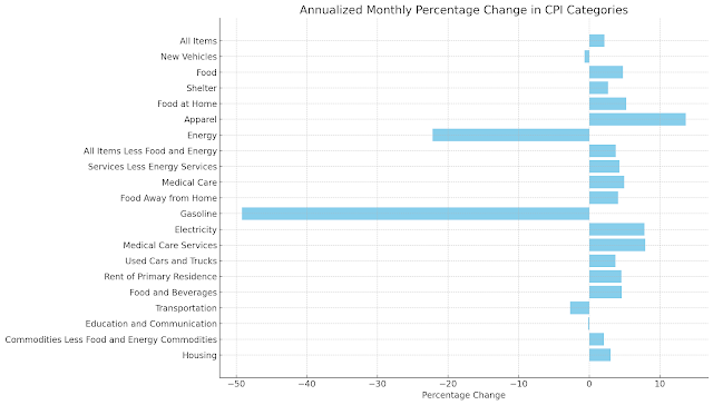
The annualized monthly percentage change gives us a closer look at how prices have shifted recently. Some categories have experienced notable increases, while others have seen sharp declines:

  • Rising Prices in Apparel and Electricity: The apparel sector saw the largest increase in prices, with a 13.7% jump. This could be due to changes in production costs, supply chain adjustments, or shifts in consumer demand. Similarly, electricity costs rose by about 7.8%, reflecting higher energy costs that directly impact utility bills for households.

  • Energy Prices See a Steep Decline: On the opposite end, energy prices have significantly decreased, with gasoline prices plummeting by 49.2%. This sharp decline suggests that recent shifts in the global oil market or changes in energy demand have made fuel more affordable, providing some relief at the pump.

  • Stable Growth in Essentials: Categories like food, medical care, and housing continue to show steady price increases. Food prices, for example, have increased by 4.8%, while shelter costs rose by 2.7%. These changes indicate ongoing pressure on household budgets, particularly for those facing rising costs in essential categories.


Year-over-Year Change: The Bigger Picture

Looking at the year-over-year percentage change allows us to see how prices have evolved over a longer period, offering insights into broader inflation trends:

  • Energy's Long-Term Adjustment: The energy sector has experienced a year-over-year decrease, with gasoline prices down by 15.3%. Although this decline is not as steep as the recent monthly changes, it reflects a longer-term adjustment in fuel costs, possibly tied to shifts in global supply and demand dynamics.

  • Persistent Increases in Shelter and Housing: The costs of shelter and housing, including rent, continue to climb, with shelter up 4.8% and rent rising by 4.8% as well. These increases highlight ongoing challenges in the housing market, where limited supply and high demand keep prices elevated. For many, housing remains a significant contributor to their overall cost of living.

  • Moderate Increases in Services: Medical care and food away from home show year-over-year increases, up by 3.3% and 3.9%, respectively. This indicates that services, especially those related to healthcare and dining, continue to experience price pressures, reflecting factors like labor costs and supply constraints.

Key Takeaways: What This Means for Consumers

The CPI data paints a complex picture of inflation. While energy prices have recently fallen, offering some short-term relief, other categories like shelter and food continue to exert upward pressure. This means that while some bills, like those at the gas station, might be lower than before, other costs, such as rent and groceries, remain a challenge.

Understanding these trends helps us see the broader economic context. For policymakers, this data is crucial in shaping decisions about interest rates and economic support measures. For consumers, it offers a way to plan and adjust budgets according to shifting price pressures.

Looking Ahead: What to Watch

As we move forward, a few factors will be key in determining the direction of inflation:

  • Energy Markets: The future of energy prices, especially with global geopolitical uncertainties, will be pivotal in shaping overall inflation. Continued declines in fuel prices could ease some inflationary pressures.

  • Housing Market Dynamics: The persistent rise in shelter costs suggests that affordability remains a significant issue in the housing market. Watching for any changes in housing supply, interest rates, and construction activity will be important.

  • Consumer Spending Patterns: Shifts in consumer spending, especially in discretionary categories like apparel, could influence how inflation evolves. If consumers pull back on spending, it could slow price increases in non-essential areas.

Conclusion

Inflation is not a one-size-fits-all story. It varies significantly across different sectors, and recent CPI data shows that while energy prices have taken a dive, essentials like shelter and food continue to weigh on household budgets. By staying informed about these trends, we can better navigate the changing economic landscape and make informed decisions for our financial futures.

Understanding the CPI and its implications can empower us to manage our expenses and anticipate changes in the broader economy. As we watch these trends unfold, it’s clear that the story of inflation is far from over—it's evolving, reflecting the complex interplay between global markets and everyday life.

Saturday, October 5, 2024

Labor Market Dynamics: A Deep Dive into Recent Trends from Labor Force Status Flows from the Current Population Survey as of September 2024

Labor Market Dynamics: A Deep Dive into Recent Trends

In today's rapidly evolving economy, understanding the intricacies of the labor market is crucial for policymakers, business leaders, and job seekers alike. Recent data on labor force flows have revealed some interesting trends that paint a complex picture of our current job market. Let's break down these findings and explore what they mean for the broader economy.


Labor Market Evaluation:
1. Job Creation and Destruction:
   - Strong job creation: 11.73% annual increase in Unemployed to Employed
   - Some job destruction: 1.35% annual increase in Employed to Unemployed

2. Labor Force Participation:
   - Decrease in labor force entry: 5.44% annual decrease in Not in Labor Force to Employed
   - Increase in labor force exit: 11.31% annual increase in Unemployed to Not in Labor Force

3. Job Stability:
   - Slight increase in job retention: 0.21% annual increase in Employed to Employed

4. Recent Trends (Monthly Changes):
   - Significant decrease in job loss: 12.03% monthly decrease in Employed to Unemployed
   - Continued job creation: 3.77% monthly increase in Unemployed to Employed

Overall, the labor market shows mixed signals. While there's strong job creation annually, there's also an increase in people leaving the labor force. Recent monthly trends indicate a potential improvement with decreasing job losses and continued job creation.

The Good News: Job Creation is Strong

One of the most positive trends we're seeing is a robust increase in job creation. The data shows an impressive 11.73% annual increase in transitions from unemployment to employment. This is a clear indicator that businesses are hiring and opportunities are opening up for job seekers.

Moreover, the most recent monthly data shows a continued positive trend, with a 3.77% increase in unemployed individuals finding jobs. This suggests that the job market remains active and is continuing to absorb available labor.

The Concerning Trend: Labor Force Participation

While job creation is strong, we're seeing some worrying signs when it comes to labor force participation. There's been a 5.44% annual decrease in people moving from "not in labor force" to "employed." This could indicate that fewer people who were previously not looking for work are entering the job market.

Even more concerning is the 11.31% annual increase in people moving from "unemployed" to "not in labor force." This suggests that a significant number of people are giving up on their job search and dropping out of the labor force entirely.

Job Stability and Churn

The data provides some insights into job stability as well. We're seeing a slight increase (0.21% annually) in employed individuals staying employed. While this increase is modest, it does suggest a degree of job stability in the current market.

However, we're also seeing a 1.35% annual increase in employed individuals becoming unemployed, indicating that there's still some job destruction occurring alongside the creation of new jobs.

Recent Positive Developments

The most recent monthly data offers some encouraging signs. There's been a significant 12.03% decrease in transitions from employed to unemployed, suggesting a slowdown in job losses. This could be an early indicator of increasing economic stability.