My objective is to simplify and clarify economics, making it accessible to everyone. It is important to remember that the opinions expressed in my writing are solely my own and should not be considered as financial advice. Any potential losses incurred from acting upon the information provided in my writing are the responsibility of the individual, and I cannot be held liable for them.
Translate
Friday, April 23, 2021
The Housing Market in Los Angeles-Long beach-Anaheim, CA as of 03/2021

library(quantmod)
library(reshape2)
library(ggplot2)
library(googleVis)
#Importing Housing Data
download.file("https://econdata.s3-us-west-2.amazonaws.com/Reports/Core/RDC_Inventory_Core_Metrics_Metro_History.csv",
destfile = "Metro_Hist.csv")
Housing_Metro <- read.csv("Metro_Hist.csv")
# Select Housing Prices for top 20 cities
Housing<- subset(Housing_Metro, Housing_Metro$HouseholdRank=='2')
Housing<-Housing[order(Housing$month_date_yyyymm),]
ratio=Housing$average_listing_price/Housing$median_listing_price
d <- density(ratio)
plot(d, main="Average Prices / Median Prices")
polygon(d, col="red", border="blue")
var0<-Housing$median_listing_price
var1<-Housing$average_listing_price
date <- seq(as.Date("2016-07-01"), by="1 month", length.out=57)
# Creating Charts
ggplot() + geom_line(aes(x=date,y=var0),color='red') +
geom_line(aes(x=date,y=var1),color='blue') +
ylab('Housing Prices')+xlab('Date')+
labs(title=" Median Listing Prices (in Red) and Average Listing Prices (in Blue)")
# Percent Chagnes
var2<-Housing$median_listing_price_yy
var3<-Housing$average_listing_price_yy
date <- seq(as.Date("2016-07-01"), by="1 month", length.out=57)
ggplot() + geom_line(aes(x=date,y=var2),color='red') +
geom_line(aes(x=date,y=var3),color='blue') +
ylab('Housing Prices')+xlab('Date')+
labs(title=" Median Listing Prices (in Red) and Average Listing Prices Y to Y (in Blue)")
barplot(Housing$active_listing_count_yy, main="Active Listing Counting"
,
names.arg = Housing$Month, cex.names = 0.3 )
barplot(Housing$median_days_on_market_yy, main="Days on Market Y to Y"
,
names.arg = Housing$Month, cex.names = 0.3 )
barplot(Housing$pending_listing_count_yy, main="Pending Listing Count Y to Y"
,
names.arg = Housing$Month, cex.names = 0.5 )
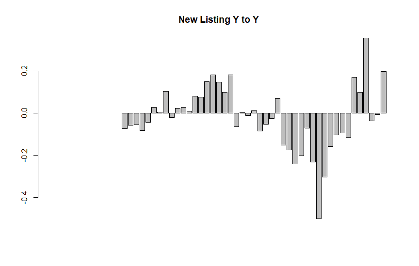
barplot(Housing$new_listing_count_yy, main="New Listing Y to Y"
,
names.arg = Housing$Month, cex.names = 0.5 )
# Basic line plot with points
ggplot(data=Housing, aes(x=month_date_yyyymm, y=ratio, group=1)) +
geom_line()+
geom_point()+
labs(title=" Ratio ( Average Price / Median Price) ")
# Basic line plot with points
ggplot(data=Housing, aes(x=month_date_yyyymm, y=active_listing_count, group=1)) +
geom_line(linetype="dashed")+
geom_point()+
labs(title=" Active Listing Count")
The housing market in New York - Newwark-Jersey city, NY-NJ-PA as of 03/2021
# Select Housing Prices for top 20 cities
Housing<- subset(Housing_Metro, Housing_Metro$HouseholdRank=='1')
Housing<-Housing[order(Housing$month_date_yyyymm),]
ratio=Housing$average_listing_price/Housing$median_listing_price
d <- density(ratio)
plot(d, main="Average Prices / Median Prices")
polygon(d, col="red", border="blue")
var0<-Housing$median_listing_price
var1<-Housing$average_listing_price
date <- seq(as.Date("2016-07-01"), by="1 month", length.out=57)
# Creating Charts
ggplot() + geom_line(aes(x=date,y=var0),color='red') +
geom_line(aes(x=date,y=var1),color='blue') +
ylab('Housing Prices')+xlab('Date')+
labs(title=" Median Listing Prices (in Red) and Average Listing Prices (in Blue)")
# Percent Chagnes
var2<-Housing$median_listing_price_yy
var3<-Housing$average_listing_price_yy
date <- seq(as.Date("2016-07-01"), by="1 month", length.out=57)
ggplot() + geom_line(aes(x=date,y=var2),color='red') +
geom_line(aes(x=date,y=var3),color='blue') +
ylab('Housing Prices')+xlab('Date')+
labs(title=" Median Listing Prices (in Red) and Average Listing Prices Y to Y (in Blue)")
barplot(Housing$active_listing_count_yy, main="Active Listing Counting"
,
names.arg = Housing$Month, cex.names = 0.3 )
barplot(Housing$median_days_on_market_yy, main="Days on Market Y to Y"
,
names.arg = Housing$Month, cex.names = 0.3 )
barplot(Housing$pending_listing_count_yy, main="Pending Listing Count Y to Y"
,
names.arg = Housing$Month, cex.names = 0.5 )
barplot(Housing$new_listing_count_yy, main="New Listing Y to Y"
,
names.arg = Housing$Month, cex.names = 0.5 )
# Basic line plot with points
ggplot(data=Housing, aes(x=month_date_yyyymm, y=ratio, group=1)) +
geom_line()+
geom_point()+
labs(title=" Ratio ( Average Price / Median Price) ")
# Basic line plot with points
ggplot(data=Housing, aes(x=month_date_yyyymm, y=active_listing_count, group=1)) +
geom_line(linetype="dashed")+
geom_point()+
labs(title=" Active Listing Count")
Thursday, April 22, 2021
Monday, December 14, 2020
Analyzing GDP by Industry with R
library(quantmod)
library(Quandl)
library(xts)
library(zoo)
Industry_Data <- read.csv("Industry Data.csv")
View(Industry_Data)
GDP<-ts(Industry_Data, start=c(2005,1), end=c(2020,2), frequency=4)
data<-GDP
data
# Percent changes from previous
percent_GDP<-diff(data, lag=4)/lag(data, k=-4)*100
Hw# Percentage of each industry in total industry
pct_GDP<-(data/data[,1])*100
summary(percent_GDP)
plot(pct_GDP)
par(mfrow=c(2,1))
plot(percent_GDP[,2], main="Private Industry")
plot(pct_GDP[,2])
par(mfrow=c(2,1))
plot(percent_GDP[,3], main=" Agriculture, forestry, fishing, and hunting")
plot(pct_GDP[,3])
par(mfrow=c(2,1))
plot(percent_GDP[,4], main=" Farms")
plot(pct_GDP[,4])
par(mfrow=c(2,1))
plot(percent_GDP[,6], main=" Mining")
plot(pct_GDP[,6])
par(mfrow=c(2,1))
plot(percent_GDP[,7], main=" Oil and gas extraction")
plot(pct_GDP[,7])
par(mfrow=c(2,1))
plot(percent_GDP[,11], main=" Construction")
plot(pct_GDP[,11])
par(mfrow=c(2,1))
plot(percent_GDP[,12], main=" Manufacturing")
plot(pct_GDP[,12])
par(mfrow=c(2,1))
plot(percent_GDP[,13], main=" Durable goods")
plot(pct_GDP[,13])
par(mfrow=c(2,1))
plot(percent_GDP[,19], main="Computer and electronic products")
plot(pct_GDP[,19])
par(mfrow=c(2,1))
plot(percent_GDP[,20], main="Electrical equipment, appliances, and components")
plot(pct_GDP[,20])
par(mfrow=c(2,1))
plot(percent_GDP[,21], main="Motor vehicles, bodies and trailers, and parts")
plot(pct_GDP[,21])
par(mfrow=c(2,1))
plot(percent_GDP[,27], main=" Textile mills and textile product mills")
plot(pct_GDP[,27])
par(mfrow=c(2,1))
plot(percent_GDP[,28], main=" Apparel and leather and allied products")
plot(pct_GDP[,28])
par(mfrow=c(2,1))
plot(percent_GDP[,34], main=" Wholesale trade")
plot(pct_GDP[,34])
par(mfrow=c(2,1))
plot(percent_GDP[,35], main=" Retail trade")
plot(pct_GDP[,35])
par(mfrow=c(2,1))
plot(percent_GDP[,40], main=" Transportation and warehousing")
plot(pct_GDP[,40])
par(mfrow=c(2,1))
plot(percent_GDP[,41], main=" Air transportation")
plot(pct_GDP[,41])
par(mfrow=c(2,1))
plot(percent_GDP[,42], main=" Rail transportation")
plot(pct_GDP[,42])
par(mfrow=c(2,1))
plot(percent_GDP[,49], main="Information")
plot(pct_GDP[,49])
par(mfrow=c(2,1))
plot(percent_GDP[,55], main=" Finance and insurance")
plot(pct_GDP[,55])
par(mfrow=c(2,1))
plot(percent_GDP[,60], main=" Real estate")
plot(pct_GDP[,60])
par(mfrow=c(2,1))
plot(percent_GDP[,62], main=" Housing")
plot(pct_GDP[,62])
Analyzing Gross Domestic Product (GDP) as of 2020-07-01
library(Quandl)
library(ggplot2)
library(tseries);library(timeseries);library(xts);library(forecast)
library (quantmod)
library(psych)
library(plotly) #install.package(plotly)
getSymbols(c('GDPDEF','GDP','PCEC','GPDI','NETEXP','GCE'), src='FRED')
ratio_PCEC=PCEC/GDP*100
ratio_GPDI=GPDI/GDP*100
ratio_NETEXP=NETEXP/GDP*100
ratio_GCE=GCE/GDP*100
basket<-cbind(ratio_PCEC, ratio_GPDI, ratio_NETEXP, ratio_GCE)
summary(basket)
tail(basket)
myColors <- c("red", "darkgreen", "goldenrod", "darkblue")
plot(x = basket, xlab = "Year", ylab = "Percent",
main = "Percent in GDP", col = myColors, screens = 1, subset = "1980-01-04/")
legend(x = "topleft", legend = c("PCEC", "GDPI", "NETEXP", "GCE"),
lty = 1, col = myColors)
describe(ratio_GPDI)
plot(ratio_PCEC, main="% of Personal Consumption Expenditure in GDP", ylab="Percent")
lines(mean_PCEC, col='red')
plot(ratio_GPDI, main="% of Gross Private Domestic Investment in GDP")
plot(ratio_NETEXP, main="% of Net Export in GDP")
plot(ratio_GCE, main="% of Government Consumption Expenditure in GDP")
Diff_GDP=Delt(GDP, k=4)*100
Diff_PCEC=Delt(PCEC, k=4)*100
Diff_GPDI=Delt(GPDI, k=4)*100
Diff_NETEXP=Delt(NETEXP, k=4)*100
Diff_GCE=Delt(GCE, k=4)*100
Diff_basket<-cbind(Diff_GDP, Diff_PCEC, Diff_GPDI, Diff_GCE)
myColors <- c("red", "darkgreen", "goldenrod", "darkblue")
plot(x = Diff_basket, xlab = "Year", ylab = "Percent",
main = "Percent in GDP", col = myColors, screens = 1, subset = "1980-01-04/")
legend(x = "topleft", legend = c("GDP", "PCEC", "GDPI", "GCE"),
lty = 1, col = myColors)
Diff_GDPDEF=Delt(GDPDEF, k=4)*100
Real_GDP=Diff_GDP-Diff_GDPDEF
plot(Real_GDP)
Subscribe to:
Posts (Atom)