Translate

Wednesday, September 13, 2017

IShares ETFs from 1-1-2017 to 9-12-2017


The following chart shows the 2017 performance charts of 
              "EWJ", #iShares Japan
             "EWG", #iShares Germany
             "EWU", #iShares UK
             "EWC", #iShares Canada
             "EWY", #iShares South Korea
             "EWA", #iShares Australia
             "EWH", #iShares Hong Kong
             "EWS", #iShares Singapore
          
             "EWT", #iShares Taiwan
             "EWZ", #iShares Brazil
             "EFA", #iShares EAFE
             "ERUS", #iShares Russia
             "EZA", #iShares South Africa
             "EPP" #iShares Pacific Ex Japan
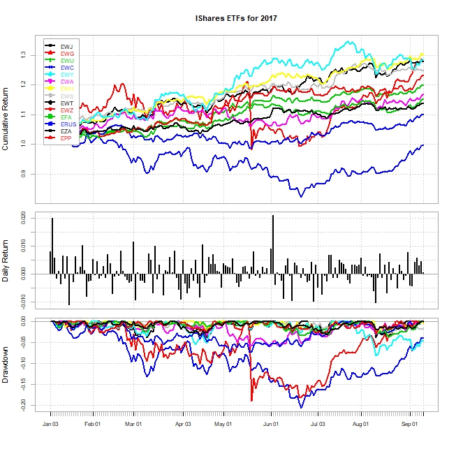
Performances of ETFs  as of 9-12-207 (from 1-1-2017)
Rank ETFs Annualized Returns Annualized STD Annualized Sharpe Ratio
1 EWH 46.0% 9.8% 4.6017
2 EWS 37.6% 10.1% 3.6736
3 EFA 30.2% 8.3% 3.5502
4 EWT 42.6% 11.9% 3.5114
5 EPP 32.5% 10.5% 3.0343
6 EWG 35.1% 11.8% 2.9228
7 EWY 43.2% 15.7% 2.7018
8 EWU 22.8% 8.9% 2.4874
9 EWJ 20.5% 8.0% 2.4797
10 EWA 25.2% 13.0% 1.8952
11 EWZ 42.8% 32.1% 1.3088
12 EZA 28.6% 22.1% 1.2609
13 EWC 14.5% 11.5% 1.2091
14 ERUS -0.7% 19.5% -0.0595


The following chart shows how annualized returns and risks have been moving during 2017.


Sunday, September 10, 2017

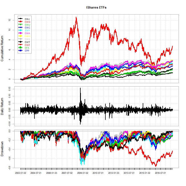
Analyzing iShares ETFs from January 2003

iShares ETFs

 
             "EWJ", #iShares Japan
             "EWG", #iShares Germany
             "EWU", #iShares UK
             "EWC", #iShares Canada
             "EWY", #iShares South Korea
             "EWA", #iShares Australia
             "EWH", #iShares Hong Kong
             "EWS", #iShares Singapore
             "EWT", #iShares Taiwan
             "EWZ", #iShares Brazil
             "EFA", #iShares EAFE
             "EPP" #iShares Pacific Ex Japan
           
  EWJEWGEWUEWCEWYEWAEWHEWSEWTEWZEFAEPP
AnnualizedReturn5.9%10.1%6.1%9.4%10.2%11.3%11.5%11.2%8.2%15.0%7.6%11.1%
AnnualizedStd21.9%26.2%23.5%22.6%32.4%27.9%25.4%25.4%27.7%37.8%22.2%25.3%
AnnualizedSharpe0.24310.36460.23750.39330.29760.3830.4310.41970.27560.38070.31970.4177


Saturday, September 9, 2017

Currencies from January 1995 to September 2017


The following chart shows the performances of currencies from January 1995 to September 2017


The Korean Won has been depreciating at 1.6% annually against dollar.

    Korea Malaysia Singapore    Taiwan China Japan Thailand    Brazil Mexico India USDOther USDBroad
Annualized Return 1.60% 2.30% -0.30% 0.60% -1.10% 0.40% 1.20% 6.00% 5.30% 3.20% 2.40% 1.00%
Annualized Std 14.10% 8.50% 5.90% 5.40% 1.70% 11.10% 10.40% 16.00% 13.20% 7.00% 4.30% 4.80%


The following chart shows the diagram of correlation matrix among currencies.


Thursday, September 7, 2017

SPDR Sector ETFs Analysis

There are eight SPDR sector ETFs :        

             "XLB", #SPDR Materials sector
             "XLE", #SPDR Energy sector
             "XLF", #SPDR Financial sector
             "XLP", #SPDR Consumer staples sector
             "XLI", #SPDR Industrial sector
             "XLU", #SPDR Utilities sector
             "XLV", #SPDR Healthcare sector
             "XLK", #SPDR Tech sector
             "XLY", #SPDR Consumer discretionary sector

the following chart shows the performances of SPDR sector ETFs from January 2003 and: XLU (Utilities sector) and XLK (Tech sector) have the highest cumulative returns.


Consumer staples sector (XLP) seems to be the best investment. (Annualized return:9.65% with Sharpe ratio is 0.7015)

           
XLB XLE XLF XLP XLI XLU XLV XLK XLY
Annualized Return 0.0942 0.0935 0.0598 0.0965 0.104 0.1117 0.0948 0.1095 0.1089
Annualized Std Dev 0.2352 0.2767 0.3182 0.1298 0.2009 0.1724 0.1604 0.2 0.2048
Annualized Sharpe (Rf=0.5%) 0.3772 0.3181 0.1712 0.7015 0.4905 0.6158 0.5567 0.5197 0.5045


Correlation Matrix Chart
             "XLB", #SPDR Materials sector
             "XLE", #SPDR Energy sector
             "XLF", #SPDR Financial sector
             "XLP", #SPDR Consumer staples sector
             "XLI", #SPDR Industrial sector


Tree Chart

             "XLB", #SPDR Materials sector
             "XLE", #SPDR Energy sector
             "XLF", #SPDR Financial sector
             "XLP", #SPDR Consumer staples sector
             "XLI", #SPDR Industrial sector
             "XLU", #SPDR Utilities sector
             "XLV", #SPDR Healthcare sector
             "XLK", #SPDR Tech sector
             "XLY", #SPDR Consumer discretionary sector


XLF (Finance sector) is connected to XLU (Utilities sector) and XLE (Energy sector) 


Thursday, August 31, 2017

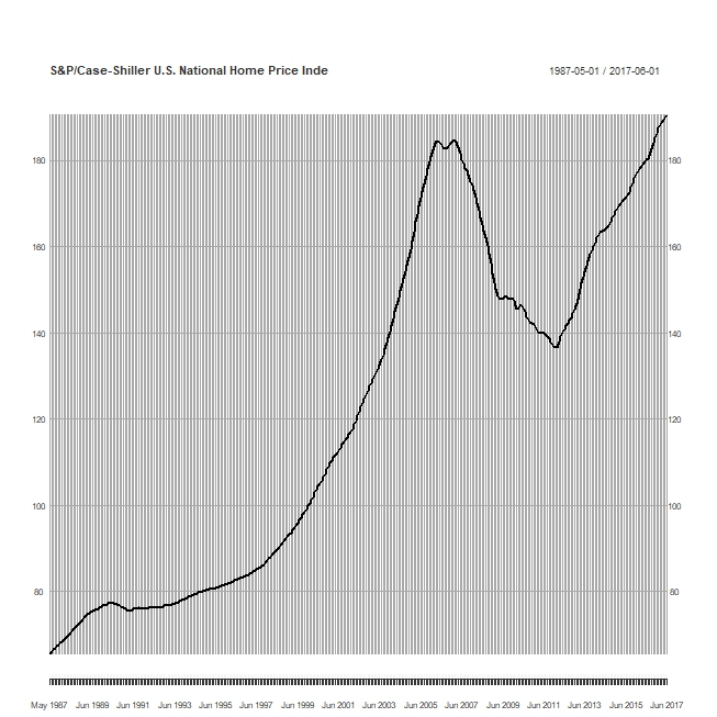
S&P/Case-Shiller MSA Home Price Index (Seasonal Adjusted) (1987/01/01=1.00) as of 6/2017

 The following charts display the S&P/Case-Shiller MSA Home price Index (1987/01/01 =1.00)  of several cities in the United States as of June, 2017. The home prices in many cities recover from the bottom caused by the financial crisis in 2007.

If you have purchased a home with $100K in the following cities in January 1987, then the value of house would be as of June 2017

San Fransco (506 K) > Los Angeles (439K ) > San Diego (438 K)  > Denver (392K) > DC (341K) > Miami (327K)> Boston (284K) > Chicago (255K) > New York(254K) > Las Vegas (243K)


Source: http://us.spindices.com/index-family/real-estate/sp-corelogic-case-shiller


Tuesday, August 29, 2017

Ratios of U.S. corporate profits by industry


Correlation Matrix

The following chart shows the correlation matrix of ratios of profits by industry in total domestic profit.

The finance industry is positively correlated with retail industry and is negatively correlated with other industries.

The manufacturing industry is positively correlated with transportation and wholesale industries and is negatively correlated with retail.

The transportation industry is positively correlated with the manufacturing industry.

The information industry is positively correlated with the transportation industry.
 The following chart shows the historical ratios of profits by industry in total U.S. corporate profits.
The following chart shows the ratio of finance industry (excluding the Fed) in all industry (excluding the profits from rest of world)


The following chart shows the ratio of manufacturing industry in all industry (excluding the profits from rest of world)

Monday, August 28, 2017

Corporate profits with inventory valuation and capital consumption adjustments: Rest of the world

The following chart shows the relationship between movements of dollar and U.S. corporate profits from rest of the world. They move opposite direction. 


The profits of U.S. corporates from rest of the world had been increasing tremendously, but staying flat lately. 


However, the growth rates of U.S. corporate profits from rest of the world had been slow down. It actually decreased from 2014 to 2016 when the Fed began to tighten the monetary policy.
The following chart shows the portion of U.S. corporate profits from rest of world in total U.S. corporate profits and it is growing which indicates the profits of U.S. corporates depend on more other countries.


Source: https://fred.stlouisfed.org/series/B394RC1Q027SBEA